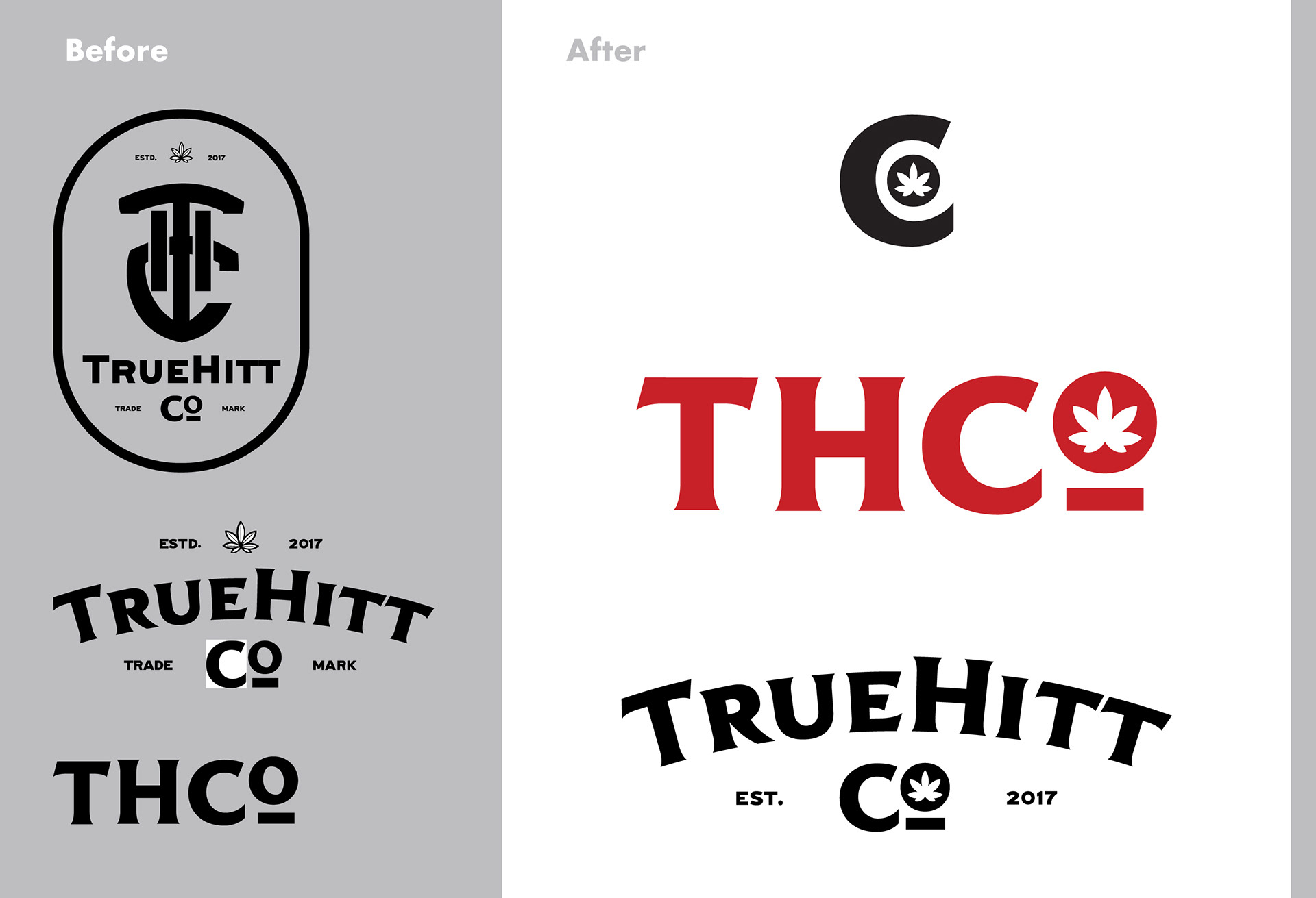
Before I was hired, Truehitt Co. was using multiple logos that often clashed and created a non-cohesive brand image.I simplified the THCo brand image by moving the leaf into the 'o' and removing the complicated elements of the logos. A special consideration was made for making the logo scalable, as most of the product packaging was small enough that using full-scale logos was untenable.
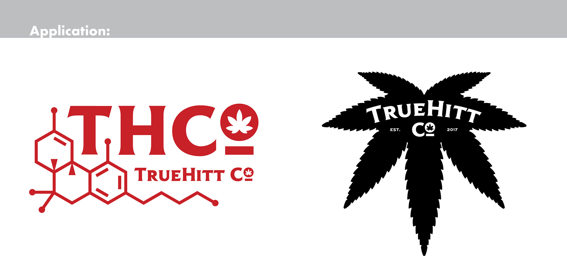
The application of the logo in merch was integral to the brand, so I also designed more decorative elements that utilized the upside-down leaf and the chemical design of THC.
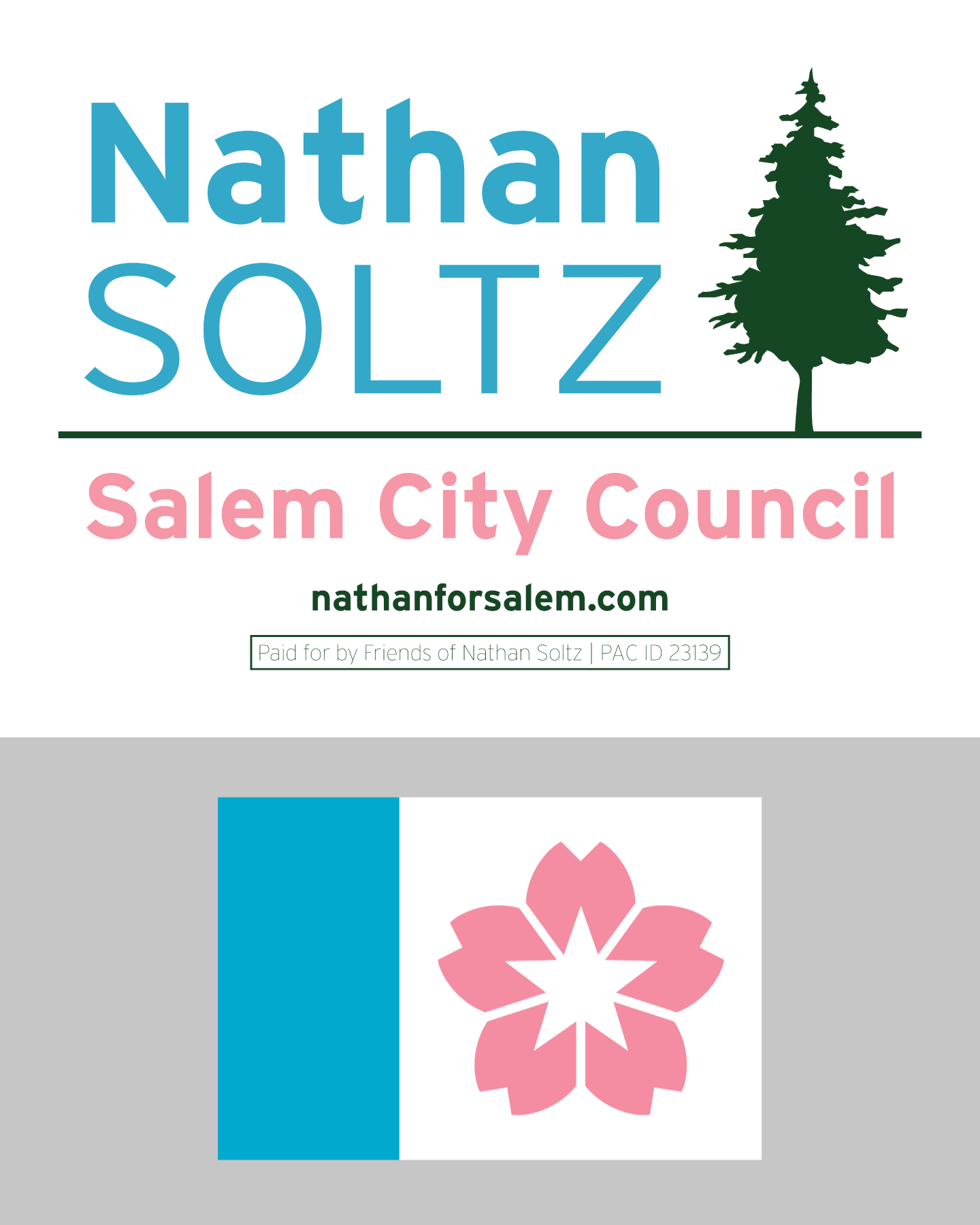
This is the first logo in a series I've created for the client, this one being the first for public office. The color scheme was specifically chosen to emulate the newest flag for the City of Salem (2022). It also reflects a personable, youthful image that encapsulates the candidate's brand. It references the iconic coniferous trees in Oregon as well as the famously abundant cherry trees in Salem.
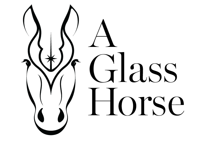
A Glass Horse is a boutique horse riding school. The logo was designed to depict a refined but approachable brand image. It also includes elements that refer to the owner's interests by subtly reflecting the design of the Jedi Order logo from Star Wars. Balancing a unique design that includes all these elements and avoids copyright issues was a fun and interesting challenge.
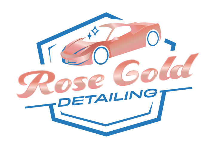
The style of this logo is in line with the client's request for a badge-style logo that was unique enough to stand out against the competition. Rose gold, metallic style was emphasized as well as a clean, 'cool' brand identity.
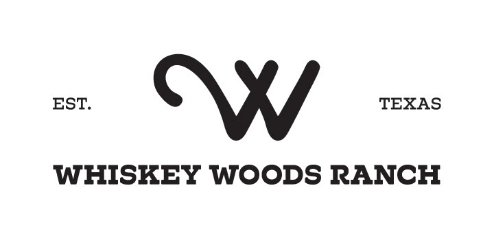
Whiskey Woods Ranch required a logo that functioned both as a logo and as a cow brand. The cow brand needed to be unique enough to be easily recognizable. In a cooperative effort with the founders of the company, I created a design that integrated the number 2 diagonally into the W, to represent the two W's in Whiskey Woods. The shape of the logo is the optimal combination of simplicity and symbolism that the client requested. The client was so pleased that they tattooed on the logo their finger.

HYRDIVITA is a holistic healthcare brand that specializes in at-home IV hydration services. This logo reflects the professional, reliable nature of their healthcare service, and the organic form helps emphasize the approachability of this concierge-level home health service.
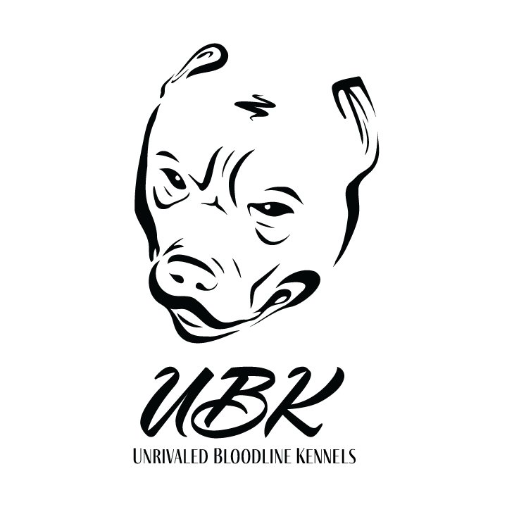
The owner of the brand specifically wanted a logo that reflected the fierce, masculine appeal of XL Pitbulls but still utilizing a script style. The design of this logo balances the image of a resilient breed without appearing outright mean. Special attention was paid to finding a 'regal' script font that was still legible.
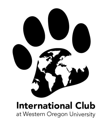
The International Club logo utilized the school's wolf mascot paw and incorporated the earth map in negative space.
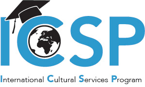
The ICSP logo utilized simple symbols of college and international context as well as a clean, bold font to be immediately recognizable
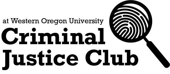
The Criminal Justice Club logo used a clean font and a symbol of a spyglass and fingerprint to establish an approachable but professional image
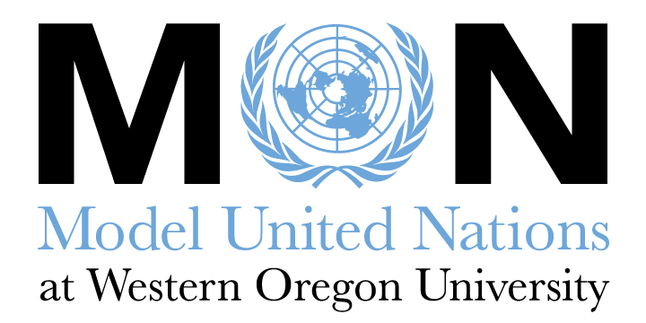
This Model United Nations club logo utilized the established logo that the larger Model United Nations organization uses, while also incorporating a unique visual style with a bold sans serif font.